1D2C case study

From sign-up
to first sale

RoleFounder and designer: flows, UI, motion, video, build direction
SurfacesAdmin web, admin phone, web store, buyer apps
BuiltOctober 2026
Product1D2C, used by 1000+ brands

The problem

A new store owner has nine jobs before a store is truly open, and most of them are not design jobs. They have to add a logo, add products, place a test order, choose a plan, connect a domain, connect payments, set up shipping, find a first customer and publish apps.

Some of those jobs live outside 1D2C. A domain needs a provider login, payments need a Razorpay account, shipping needs Shiprocket, and an App Store review can take up to four weeks. Owners were being asked to think like a technical team, and the product had to carry that weight for them.

Nine steps, one Home

Pick a step. Each opens inside Home with its action, a short video and the exact things the owner needs in hand.

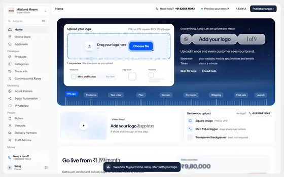
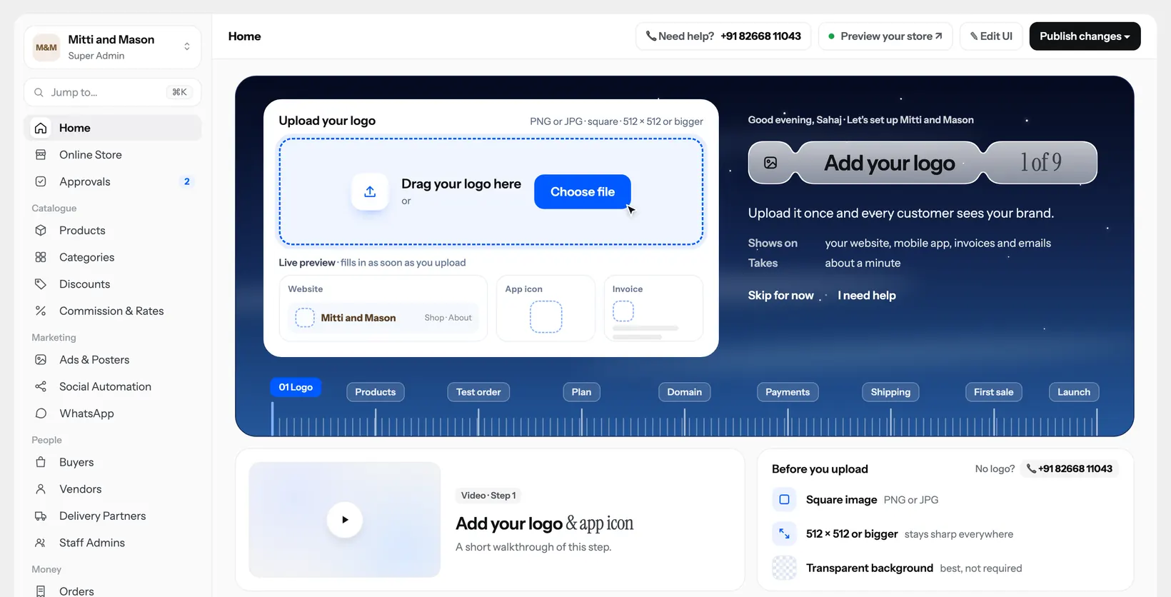
Add your logo step on the onboarding Home

Add your logo

Upload once and every customer sees it on the website, mobile app, invoices and emails.

Needs
Square PNG or JPG, 512 × 512 or bigger
Way out
No logo? Skip for now, or ask for help

Design file with a demo store. Mitti and Mason is a sample brand, so its figures are not real data.

Five decisions

The choices that shaped the flow, and what I turned down.

Motion, continuity

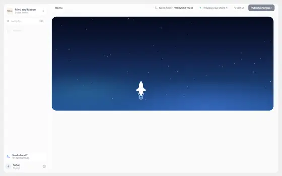
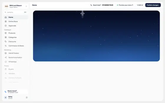
One sky, from the first screen to Home

Chose
Sign-up ends with the background shrinking until it lands exactly on the Home hero. The owner never leaves the place they started.
Turned down
A success page, then a normal route change into a dashboard.
Why
The moment after sign-up is when a new owner meets the most complexity. A hard cut says "now you're on your own".

Sky starts shrinking380 msSky starts shrinking
Sidebar slides in620 msSidebar slides in
Sky lands on the hero900 msSky lands on the hero
First action pulses2600 msFirst action pulses
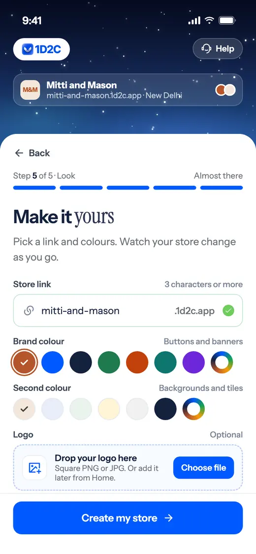
Flow, sign-up

Five short steps with a store that builds itself

Chose
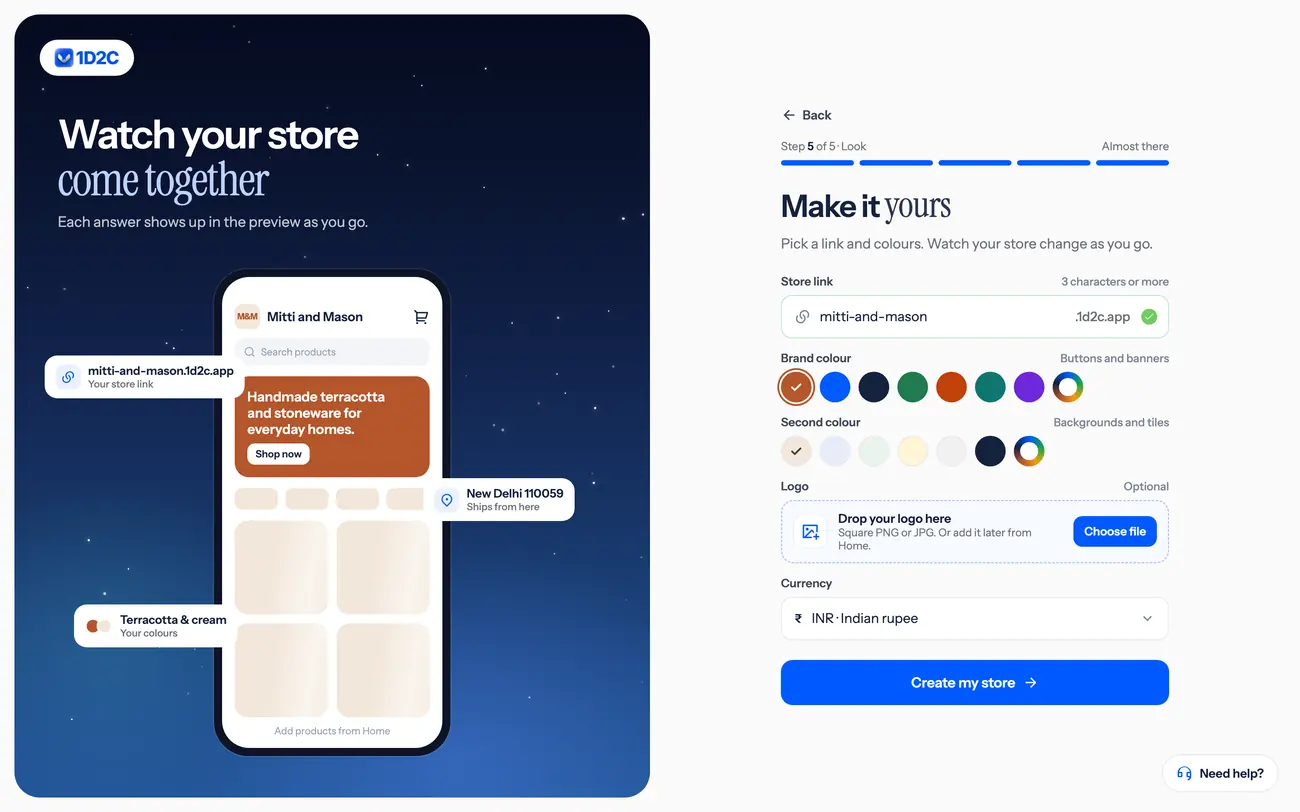
I split two long pages into five steps and kept every field. A live preview shows each answer landing on the website and app.
Turned down
Cutting fields to look shorter. The business needs them, so I changed the pace and left the data alone.
Why
Forms feel like tax. A preview makes the same typing feel like making something.
Sign-up Look step on desktopSign-up Look step on a phone12
  • 1Five-segment progress bar with "Almost there" in place of a percentage
  • 2Rows rise 6 px over 420 ms, staggered 32 ms apart
Logic, edge cases

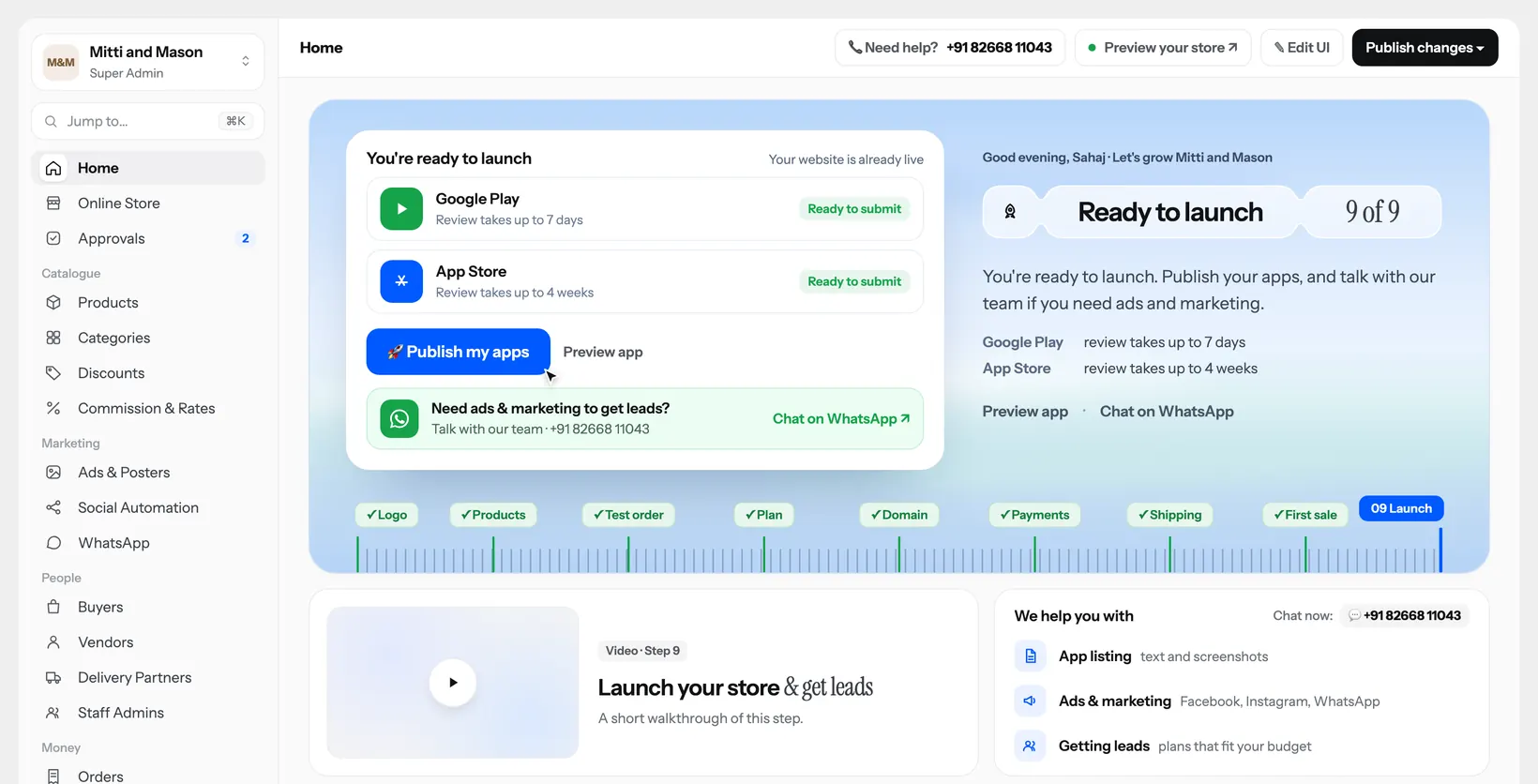
Launch changes with the plan, and can be skipped

Chose
A website-only plan counts Launch as done. Other plans show Google Play and App Store rows with their true state, and "Skip for now" still reaches the working Home.
Turned down
One launch step for everyone, which would hold owners back for a review that can take four weeks.
Why
A checklist should never block on something the owner can't control.
Launch step with Google Play and App Store rows

Review times shown to owners: up to 7 days on Google Play, up to 4 weeks on the App Store.

Trust

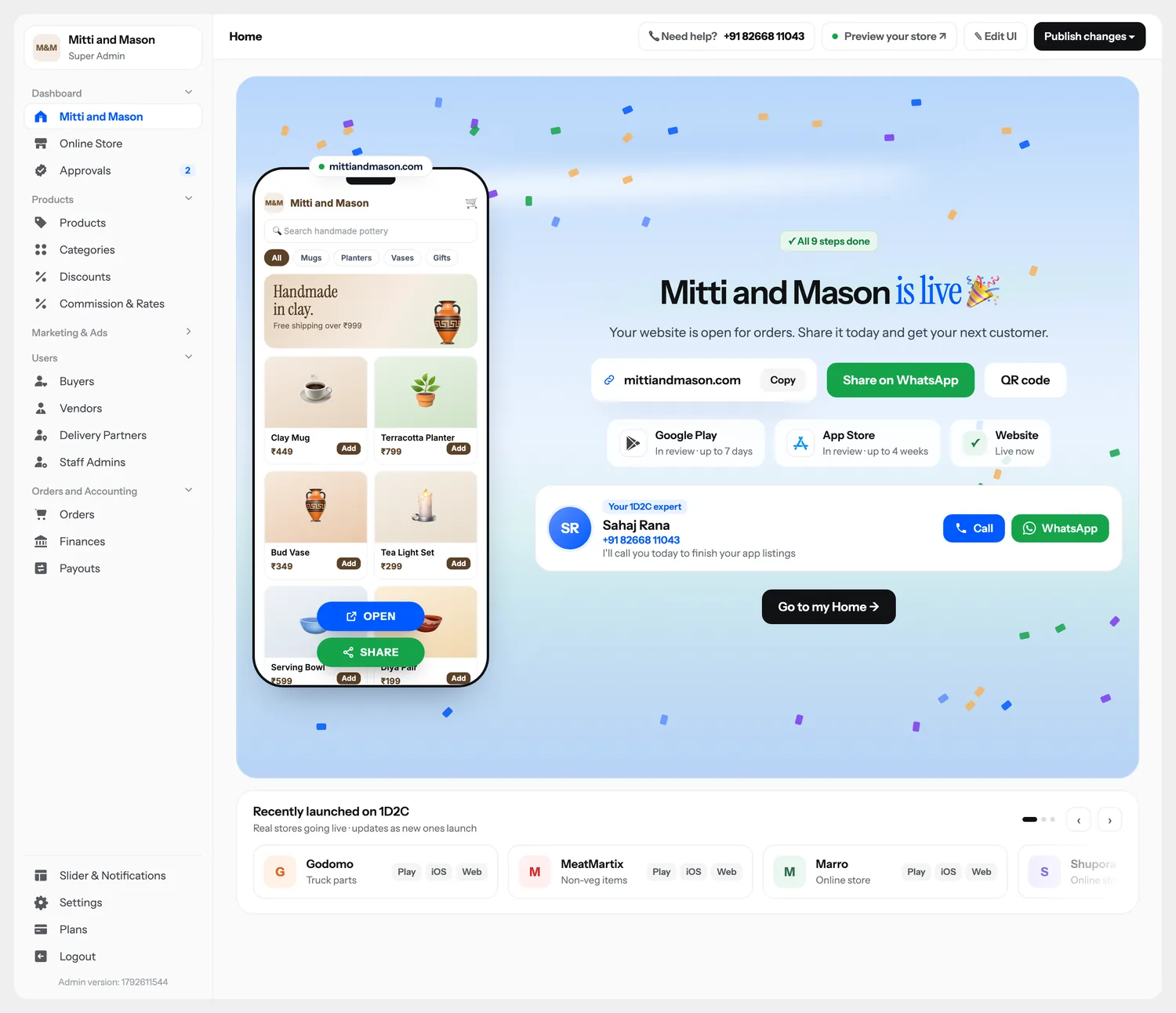
A real person's number inside the product

Chose
Every step has "I need help", and Home carries my own name, number and WhatsApp.
Turned down
A help centre link and a ticket form.
Why
An owner who gets stuck needs a person more than a form.
You're live screen with the expert card3
  • 3Call and WhatsApp stay equal width and stack on narrow screens
Information design

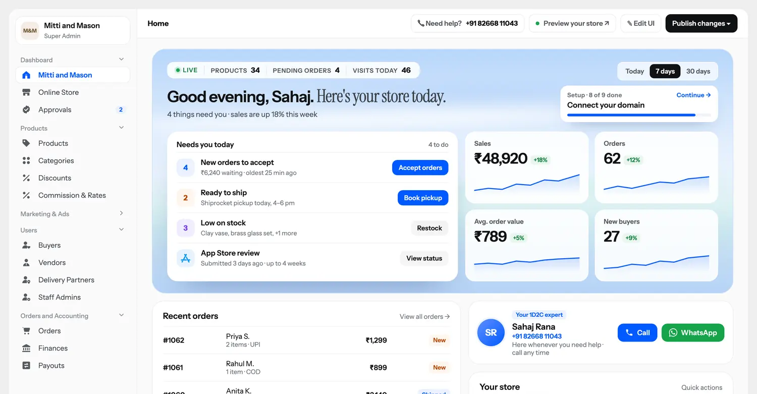
After launch, Home turns into a to-do list

Chose
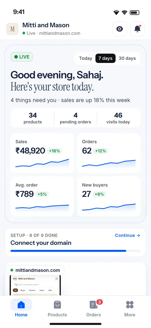
"Needs you today" comes first, with one button per task, and numbers sit beside it. Setup progress stays until all nine steps are done, then disappears. Phones get their own order: setup, store, needs, orders.
Turned down
A KPI dashboard first.
Why
A small owner opens the app to find out what to do next.
After-launch Home on desktopAfter-launch Home on a phone

What shipped

Design and build ran together. I checked every layout at 1440, 1024 and 390 with automated tests.

9

inline step panels on one Home

18

voiced, subtitled videos, one landscape and one portrait per step

48

sign-in and sign-up screens, 24 desktop and 24 phone

41 KB

for 12 animations after zipping, down from about 500 KB of JSON

One thing I caught late

Resizing the window made the phone preview snap to a default size for a single frame. A screen recording showed it. The layout code was resetting its measurements on every rebuild, so I removed the reset and made that a written rule for the project.

Keep lookingAll products and case studies ↗